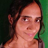
Divya Srinivasan

About Author
Divya Srinivasan is an illustrator and animator living in Austin, Texas. Her illustrations appear in The New Yorker magazine, and she has done work for This American Life, They Might Be Giants, Sundance Channel, Sufjan Stevens and Weird Al Yankovic, among others.
Interview
CINNAMON
BLOOMSBURY CHILDREN'S BOOKS
MAY 2019
CINNAMON, a fable by NEIL GAIMAN about a princess in India who doesn't speak, has been published as a picture book with lush, jewel-like illustrations by DIVYA SRINIVASAN.
In the tale, the princess's parents send out a desperate plea for someone to help their daughter to speak. One day, a tiger answers their call and sets about helping the princess to speak, but with unexpected outcomes.
We asked DIVYA SRINIVASAN, illustrator and animator from Texas, to tell us how the project developed:
Q: How did you move into picture book illustration and what are your favourite kinds of text to illustrate?
A: I had been a freelance illustrator and animator since 1999. I had done animated video projects for bands including Weird Al Yankovic, Spoon, The Octopus Project, and a bunch of videos for children's songs by They Might Be Giants. For New Yorker magazine, I would be given a movie review, theater review, or some event like a music show or art exhibition, and I would do an illustration to represent the topic. I was used to being given a topic that I would then represent as an illustration. I was also very lucky to be given a lot of freedom in how I interpreted the subject.
In 2008 and 2009, I wasn't getting enough assignments that I liked, so I took two months off from working on other people's projects, and to work on something of my own. I'd long been interested in making a picture book, so I gave it a shot. I was excited to write a story, keeping in mind what would be fun to illustrate. After the two months, I had a version of Little Owl's Night that I sent out to some editors, and happily, one of the editors wanted to publish it.
Q: What drew you to illustrating Cinnamon, which reads like an Indian folk tale?
A: Thankfully, my agent heard about the project, thought I was a good fit, and connected me to the project's art director. I was really excited when he told me the story was by Neil Gaiman, and when I read the story, I started imagining how characters and elements might look.
It seemed really fun to illustrate, and I hadn't yet illustrated any stories with a connection to my Indian background. It felt special. I was thinking about my mother's saris and other pieces of art in our house, photos I'd taken on visits to India, and I loved that I could use such personal items as reference for this book's illustrations.
To make sure my ideas and the art director's were in sync, I sent her samples of the main characters, which she then showed the editor and Neil. And we were off!
Q: What were your priorities in the illustration style you chose?
A: It was important that the characters were expressive and that were clearly Indian. I wanted to incorporate visual patterns I'd grown up with. I wanted the book's world to look lush, hot, majestic and old, as Neil's story suggests.
The parrot's limerick is so different than the rest of the book, I used a different style for that part. I used a style that was like folk art, trying to mimic the traditional feel of the rhyme.
Q: The illustrations are bright, jewel-like. Can you tell us how the colour palette developed?
A: Cinnamon sees the world in "pale white and pink, and softly glowing", so that description determined one of the early spreads, but probably made pink more prominent in the palette than it might have been otherwise.
I looked to traditional Indian clothing I grew up with, that I wore, that my family and relatives wear, that I've seen. I don't even think it was a conscious decision, choosing a palette ahead of time. I try putting colours together that look pleasing to me.
Buildings in India are often painted colours I might not expect like yellow, pink, sea green, and again, there are patterns everywhere. I wanted to incorporate colour and pattern, and use colors in the background that hopefully wouldn't distract from the main characters who were usually wearing bolder colours.
The vegetation in India is ubiquitous. I wanted to include flowers and plants wherever I could, often through the palace windows.
Q: The tiger takes a central role in the story, helping the blind princess to speak. He is described as moving 'like a god through the people'; how hard was this to convey?
A: I looked at photos and video of tigers for reference, and did my best to make the tiger look commanding at all times. I tried to make the tiger large and looming.
Q: There are also some quite scary moments; the girl being frightened by the tiger and especially, the old aunt being 'silenced' by the tiger. How did you approach these?
A: It was actually a little scary for me looking up photos of tigers making fierce expressions for the scene where he teaches Cinnamon "fear". But drawing it was really fun.
It was so fun (I know I'm using the word 'fun' a lot, but having fun illustrating is when the best work happens, I think. It's important!) to draw the old aunt, especially in the two spreads where she is about to be eaten... her expressions, her hair, her clothes, and her tea set (which is modeled off a decorative set my parents have had since I was little). I had the aunt sitting on a tiger skin rug, which I hoped would help add to the reasons the tiger isn't tolerant towards her. I decided to show the moment before the tiger gets her. It seemed the only way.
Q: What other challenges were there in illustrating this story?
A: This was the first time I illustrated a story that I hadn't written. The books I have written and illustrated are for much younger kids and there are fewer words, so I don't have to worry as much about how a block of text might affect the illustration's composition.
Splitting up the text into the pages, trying to make sure that the page breaks didn't somehow change aspects of the story, while also trying not to make certain spreads too text-heavy... I was a bit nervous about that. But the art director and editor and Neil were wonderful to work with, which made that process easier.
The biggest challenge was that I had just found out I was pregnant with my daughter when I got this assignment. I was thrilled that I'd spend this unique time of my life working on such a cool project AND one set in India.
The illustrations in this book had a lot of small details that strained my eyes during pregnancy, and I was getting tired easily. So I did part of the book before my daughter was born, not as much as I'd hoped though. A few months after my daughter was born, my parents were able to watch her while I worked. And during my work breaks, I would feed her and play with her. It felt very special.
(By the way, I hid stylized versions of my daughter's name and my niece's name as a pattern in a window. Secret-style!)
Q: What media do you use in your illustration work generally, and for Cinnamon? How do your illustrations develop, what is the process for you?
A: I've used different media... pencil, pen, colored pencils, watercolors, scanning in artwork done on paper and then compositing it digitally. But for a long while now, I've mainly been drawing straight onto the computer with a tablet, using Photoshop. That's how I've illustrated all my books so far, including Cinnamon.
I started using a tablet when I was an animator on the film Waking Life, directed by Richard Linklater. It ended up being a really fun way to draw, make changes, and try out different color combinations quickly. It felt just as easy for me to draw on the computer as on paper. For most all of my animated videos, I drew and animated the elements on the computer.
When I was doing illustration for New Yorker magazine, there was usually a very fast turnaround and there could also be revisions needed in that time. The art directors there liked the style of work on the computer, so that's what I ended up doing. So working on the computer has been the go-to for some time. Though I do like to draw and color and paint on paper as well. So I'd love to mix it up for the right project.
Q: Are there particular spreads or moments in the story that stand out for you?
A: In my first or second reading of the story, I knew exactly how I wanted the scene to look where Cinnamon and the tiger go into the forest. It's an important point in the story... the last time we see Cinnamon and the tiger. I had read Amar Chitra Kathas, the famous Indian comic books, since I was little, and the cover of the book about the Hindu god Ayyappan shows him riding a tiger. I wanted to echo that posture, that confidence in this spread. I did a version of that spread for the cover, with her walking alongside the tiger instead.
Q: Cinnamon is a layered story; is there a message that stands out for you, or something you would like children to take away from it?
A: I really like that though Cinnamon is blind and does not talk (until the end), it is clear to us that she is strong, brave, and wise. Her aunt underestimates her (as do others, such as her teacher) because she doesn't talk, thinking it's because she isn't bright enough to learn. Sometimes people don't talk because they don't feel like it, and that's that.
 Cinnamon